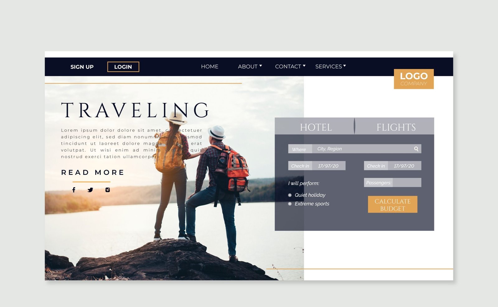
In today’s digital era, users access websites from a wide range of devices, including desktops, tablets, and mobile phones. Ensuring a seamless user experience across all these platforms is essential for website success. Responsive web design (RWD) is a modern web development approach that allows websites to adapt to various screen sizes, ensuring optimal usability and performance. This comprehensive guide will take you through the core principles, techniques, and best practices for implementing responsive web design.
Understanding Responsive Web Design
Responsive web design is a methodology that ensures web pages adjust dynamically to different screen sizes and orientations. It eliminates the need for separate versions of a website for different devices and enhances the user experience by providing consistent navigation, readability, and accessibility.
Key Elements of Responsive Web Design:
- Fluid Grid Layouts – Using flexible grids that resize proportionally rather than with fixed measurements.
- Flexible Images and Media – Ensuring images and multimedia elements scale correctly based on the viewport.
- CSS Media Queries – Adapting styles based on screen size, resolution, or orientation.
- Mobile-First Approach – Designing for mobile devices first, then enhancing for larger screens.
- Responsive Navigation – Implementing flexible navigation menus that adapt to different devices.
- Testing and Optimization – Ensuring the website performs well across different screens through rigorous testing.
Step 1: Setting Up a Fluid Grid System
A fluid grid system is the foundation of responsive design. Instead of using fixed units like pixels, designers use relative units such as percentages, ems, and rems to ensure content scales proportionally. Many modern CSS frameworks, like Bootstrap and Tailwind CSS, offer pre-built responsive grid systems that make implementation easier.
Step 2: Implementing Flexible Images and Media
Images and media should be flexible so they don’t overflow their containers. This can be achieved by:
- Setting max-width: 100% and height: auto to ensure images resize dynamically.
- Using the srcset attribute to serve different image resolutions based on device capability.
- Utilizing the picture element for better performance and adaptability.
Step 3: Utilizing CSS Media Queries
Media queries allow developers to define CSS rules based on the device’s characteristics. They help apply different styles for different screen sizes.
Common Breakpoints:
- Mobile (Up to 600px): Small screens like smartphones.
- Tablet (601px – 1024px): Medium-sized screens like tablets.
- Desktop (1025px and above): Larger screens like laptops and desktops.
Step 4: Embracing the Mobile-First Approach
Designing for mobile-first means starting with a mobile-friendly layout and gradually adding enhancements for larger screens. This approach improves performance, as mobile users typically have limited bandwidth and processing power.
Mobile-First Design Strategy:
- Start with a simple, single-column layout.
- Optimize images and assets for mobile performance.
- Use touch-friendly buttons and navigation.
- Add media queries to scale up for larger screens.
Step 5: Creating Responsive Navigation
Navigation should be intuitive and adaptable to different screen sizes. Some common responsive navigation techniques include:
- Hamburger Menus: A collapsible menu for mobile screens.
- Dropdown Menus: Expanding menus for better organization.
- Sticky Navigation: A menu that remains visible as users scroll.
Step 6: Testing and Optimization
Testing is crucial to ensure that the website works well across all devices and browsers. Developers should:
- Use browser developer tools to simulate various screen sizes.
- Test on real devices to detect inconsistencies.
- Optimize images and code for better performance.
- Ensure accessibility compliance (WCAG standards).
Tools for Responsive Web Design
Several tools can assist in building responsive websites efficiently:
- Bootstrap: A powerful CSS framework with a responsive grid system.
- Tailwind CSS: A utility-first CSS framework that enables custom responsiveness.
- Google Lighthouse: A tool for analyzing and optimizing website performance.
- Chrome DevTools: A built-in browser tool for testing responsive layouts.
Benefits of Responsive Web Design
Adopting responsive web design offers numerous benefits, including:
- Improved User Experience: Seamless and consistent interface across devices.
- Better SEO Rankings: Google favors mobile-friendly websites.
- Cost Efficiency: Eliminates the need for separate mobile and desktop sites.
- Higher Conversion Rates: Users are more likely to engage and convert.
- Future-Proofing: Adapts to new devices and screen sizes automatically.
Conclusion
Responsive web design is no longer an option but a necessity in the modern web landscape. By implementing fluid grids, flexible media, media queries, and a mobile-first approach, developers can create seamless and adaptive websites. Regular testing and optimization ensure the site remains efficient and user-friendly. By following these best practices, web developers can build high-performing, accessible, and visually appealing websites that cater to a wide range of users.


