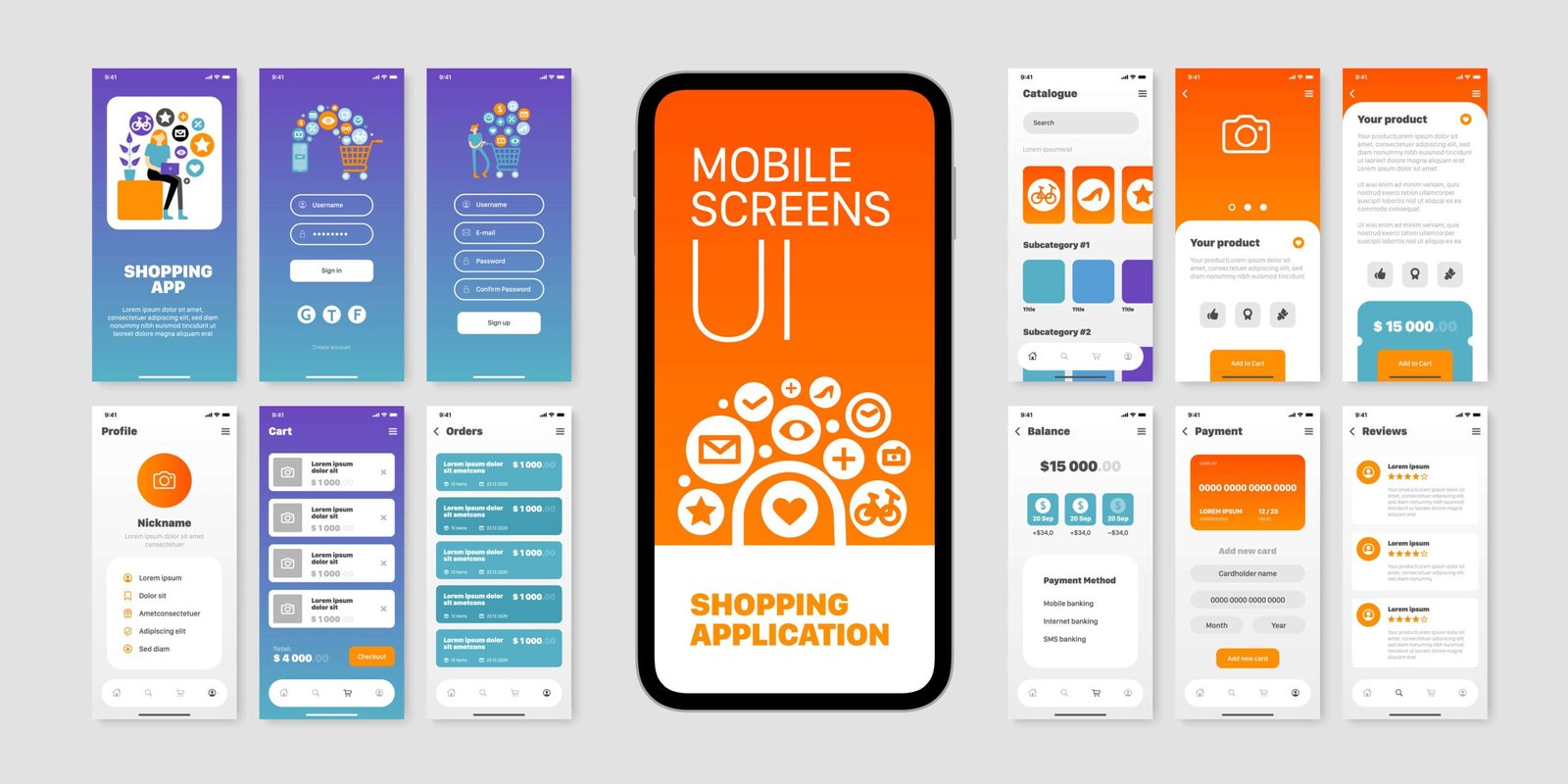
In today’s digital-first world, users access websites on a variety of devices—from smartphones and tablets to laptops and desktops. To deliver a seamless and enjoyable user experience (UX) across all these platforms, responsive web design (RWD) has become a non-negotiable aspect of modern web development. Here’s a deep dive into why responsive design is the backbone of great UX and how to implement it effectively.
What is Responsive Web Design?
Responsive Web Design ensures that a website’s layout, content, and functionality adapt fluidly to different screen sizes and orientations. By using flexible grids, fluid images, and CSS media queries, RWD creates a unified experience regardless of the device being used.
Key Features of RWD:
- Content adjusts dynamically based on screen size.
- Seamless transitions between landscape and portrait modes.
- Consistent design and functionality across all devices.
Example: Websites like Amazon and Airbnb seamlessly adapt to various screen sizes, offering optimal experiences for users everywhere.
Why Responsive Web Design is Crucial for Great UX
1. Enhanced Accessibility
Responsive design ensures that users can access and interact with content regardless of their device. A well-designed responsive website is inclusive, catering to a broad audience.
Benefits:
- Simplifies navigation on smaller screens.
- Makes content accessible for mobile-dependent users.
- Reduces bounce rates caused by non-optimized layouts.
2. Seamless Multi-Device Experience
In an era where users frequently switch between devices, consistency is key. Responsive design offers a unified look and feel, strengthening brand perception and improving usability.
Example: A user shopping on a smartphone during a commute can continue the same experience on a desktop later without disruptions.
3. Faster Load Times
Responsive design optimizes images and layouts for different devices, ensuring faster load times, especially on mobile.
Why It Matters:
- Users expect websites to load within 2-3 seconds.
- Faster sites improve user satisfaction and engagement.
- Search engines prioritize speed, enhancing SEO rankings.
4. Better SEO Performance
Google recommends responsive web design as a best practice for mobile-first indexing. A single, responsive site consolidates traffic, improves rankings, and eliminates the need for separate mobile URLs.
SEO Benefits:
- Easier indexing by search engines.
- Lower bounce rates due to better usability.
- Improved link-building and sharing potential.
5. Cost-Effective Maintenance
A single responsive website is easier to manage than maintaining separate desktop and mobile versions. This reduces costs while ensuring consistency in design and functionality.
Core Principles of Responsive Web Design
1. Flexible Grid Systems
Design layouts using relative units like percentages rather than fixed pixel widths. This ensures that content scales proportionally across devices.
Example: A three-column layout on a desktop might become a single-column layout on a smartphone.
2. Fluid Images and Media
Ensure that images and videos resize dynamically based on screen dimensions.
How to Implement:
- Use CSS properties like max-width: 100% to prevent images from overflowing their containers.
- Optimize media for faster load times on mobile devices.
3. Mobile-First Design Approach
Start designing for the smallest screen first, then scale up for larger devices.
Why It’s Effective:
- Prioritizes essential content and functionality.
- Simplifies the transition to larger screens.
- Encourages a focus on core UX elements.
4. Touch-Friendly Design
For mobile devices, ensure interactive elements like buttons and links are large enough to be tapped easily.
Best Practices:
- Use a minimum touch target size of 48×48 pixels.
- Add enough spacing between clickable elements to avoid accidental taps.
Common Challenges in Responsive Design and How to Overcome Them
1. Content Prioritization
Problem: Small screens limit the amount of visible content.
Solution: Use collapsible menus, tabs, or carousels to organize content effectively.
2. Testing Across Devices
Problem: Ensuring consistent performance across a vast array of devices.
Solution: Use tools like BrowserStack, Responsinator, or Google Chrome DevTools to test responsiveness.
3. Performance Optimization
Problem: Large images or excessive scripts can slow down mobile performance.
Solution: Use lazy loading, compress assets, and minimize CSS/JavaScript files.
Future of Responsive Web Design
Responsive web design is constantly evolving to accommodate emerging technologies like foldable screens, wearable devices, and augmented reality (AR). Designers must focus on adaptability, performance, and usability to stay ahead.
Emerging Trends:
- Viewport Adaptability: Designing for foldable and dual-screen devices.
- Advanced Media Queries: Supporting dynamic UI changes based on user behavior.
- AI-Driven Personalization: Responsive layouts that adapt to individual user preferences.
Conclusion
Responsive web design is not just a feature—it’s the foundation of delivering exceptional UX in a multi-device world. By prioritizing flexibility, performance, and accessibility, businesses can ensure their websites remain user-friendly and relevant.
Whether you’re designing a corporate website, an e-commerce platform, or a personal blog, responsive design is the key to creating meaningful, accessible, and engaging digital experiences for all users.
Devoq Design is a premier UI/UX design agency with a strong presence in both Central Coast and Wollongong. Renowned for their innovative and user-centric approach, Devoq Design specializes in creating seamless and engaging digital experiences. As a leading UI/UX Design Agency in Central Coast, they cater to a diverse range of industries, ensuring each project is tailored to meet the specific needs of their clients. Similarly, as a top UI/UX Design Agency in Wollongong , Devoq Design combines cutting-edge technology with creative expertise to deliver exceptional results that drive business growth and user satisfaction.


