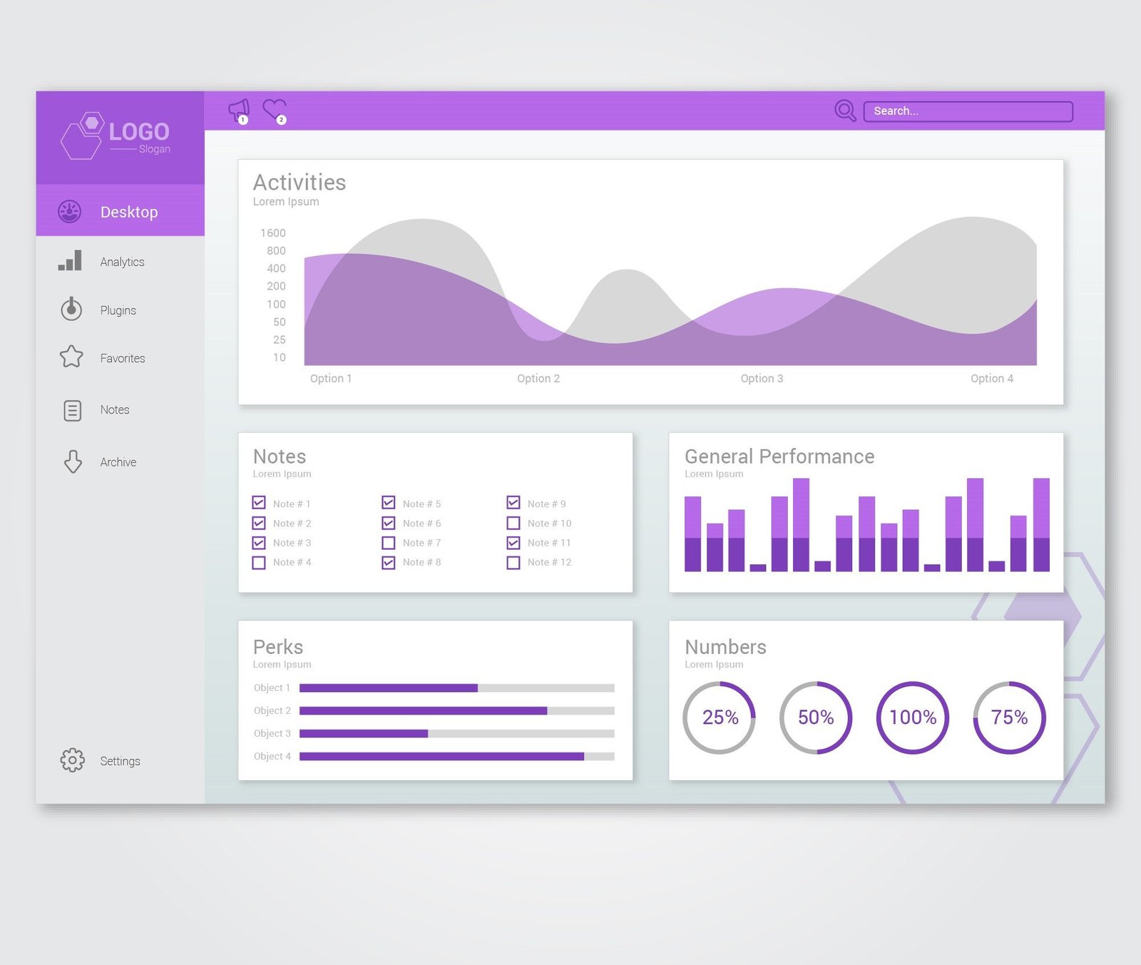
In today’s digital world, data is the backbone of business decision-making. However, raw data alone can be overwhelming and difficult to interpret. This is where data visualization in dashboard design plays a crucial role. A well-designed dashboard translates complex data into meaningful insights, allowing users to make informed decisions quickly and efficiently.
The art of data visualization involves using design principles, user experience (UX) strategies, and data storytelling techniques to create dashboards that are both functional and aesthetically pleasing. This blog explores key elements of effective dashboard design, best practices for data visualization, and how to avoid common pitfalls.
The Importance of Data Visualization in Dashboards
1. Enhancing Decision-Making
A well-designed dashboard transforms raw data into a visually intuitive format, making it easier to identify patterns, trends, and outliers. Decision-makers can quickly interpret key metrics and take action based on real-time data.
2. Improving User Experience (UX)
A dashboard should provide a seamless and efficient user experience. By using the right visualization techniques, users can quickly grasp information without cognitive overload. This leads to better productivity and user satisfaction.
3. Telling a Story with Data
Effective dashboards go beyond displaying numbers; they tell a story. Data storytelling involves arranging visuals in a way that guides users through insights logically, helping them connect the dots and derive meaningful conclusions.
Key Elements of Effective Dashboard Design
1. Understanding the User and Their Needs
Before designing a dashboard, it is crucial to identify:
- Who will use the dashboard? (Executives, analysts, managers, etc.)
- What key metrics do they need?
- How will they interact with the data?
A user-centered approach ensures that the dashboard serves its intended purpose without unnecessary complexity.
2. Choosing the Right Data Visualizations
Not all visualizations are suitable for every dataset. Selecting the right type of visualization improves clarity and effectiveness:
- Bar Charts – Best for comparing different categories.
- Line Graphs – Ideal for showing trends over time.
- Pie Charts – Useful for illustrating proportions but should be used sparingly.
- Heatmaps – Great for visualizing patterns and correlations.
- Scatter Plots – Effective for identifying relationships between variables.
3. Maintaining Simplicity and Clarity
Overloading a dashboard with excessive data points or visuals can lead to confusion. Minimalism in dashboard design helps users focus on what’s important. Some strategies include:
- Using whitespace to reduce clutter.
- Grouping related data elements together.
- Highlighting key metrics using contrast and color.
4. Ensuring Responsiveness and Accessibility
Modern dashboards should be designed to work seamlessly across different devices, from desktops to mobile screens. Accessibility considerations, such as colorblind-friendly palettes, readable fonts, and keyboard navigation, ensure that all users can interact with the data efficiently.
5. Implementing Real-Time Data Updates
For dashboards that track real-time metrics, ensuring data updates without performance lags is essential. Implementing auto-refresh features, dynamic charts, and interactive elements improves usability and keeps information current.
Best Practices for Data Visualization in Dashboard Design
1. Use a Logical Layout
A well-structured layout improves navigation and comprehension. Consider the Z-pattern or F-pattern layout, where users naturally scan from left to right and top to bottom.
2. Color Coding with Purpose
Color should be used strategically to convey meaning:
- Green for positive trends, red for warnings.
- Blue for neutral data representation.
- Using contrasting colors for emphasis.
Avoid using too many colors, as this can cause distraction and reduce readability.
3. Incorporate Interactive Features
Interactive elements such as filters, dropdowns, and drill-downs allow users to explore data in more depth without cluttering the dashboard.
4. Optimize Data Density
Striking a balance between too little and too much information is key. Prioritize high-impact data points and consider using progressive disclosure—showing more details only when needed.
5. Regular Testing and Iteration
Dashboards should be continuously tested for usability. Gathering user feedback and analyzing interaction patterns help refine the design for better efficiency.
Common Mistakes to Avoid in Dashboard Design
1. Overloading with Too Much Data
Cramming too many metrics or visuals into a single dashboard creates clutter and makes it difficult for users to focus.
2. Using the Wrong Chart Types
Selecting inappropriate chart types can misrepresent data. For instance, using a pie chart to compare 10 different categories can make it hard to interpret proportions accurately.
3. Ignoring Data Context
Context matters in data visualization. Without labels, tooltips, and explanatory notes, users may misinterpret the data.
4. Poor Mobile Optimization
Dashboards should be responsive and optimized for mobile viewing, ensuring usability across different screen sizes.
5. Inconsistent Design Elements
Using inconsistent fonts, colors, and layouts can create confusion. A well-structured visual hierarchy improves readability and comprehension.
Conclusion
Data visualization in dashboard design is a powerful tool for transforming raw data into actionable insights. By focusing on user needs, choosing the right visualizations, maintaining simplicity, and implementing interactivity, designers can create dashboards that drive informed decision-making.As technology evolves, dashboard design continues to improve, integrating AI-driven insights, automation, and better accessibility features. By following best practices and avoiding common mistakes, businesses can leverage data visualization to enhance efficiency and decision-making in a visually compelling manner.